Project overview
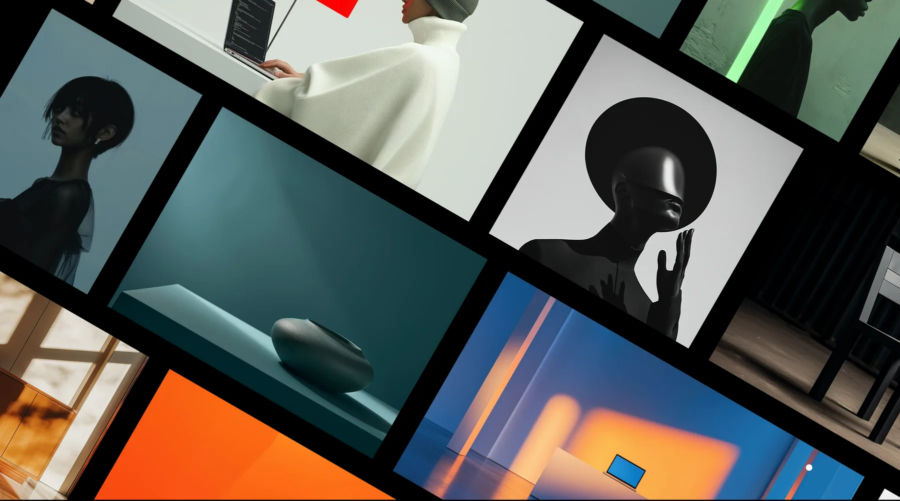
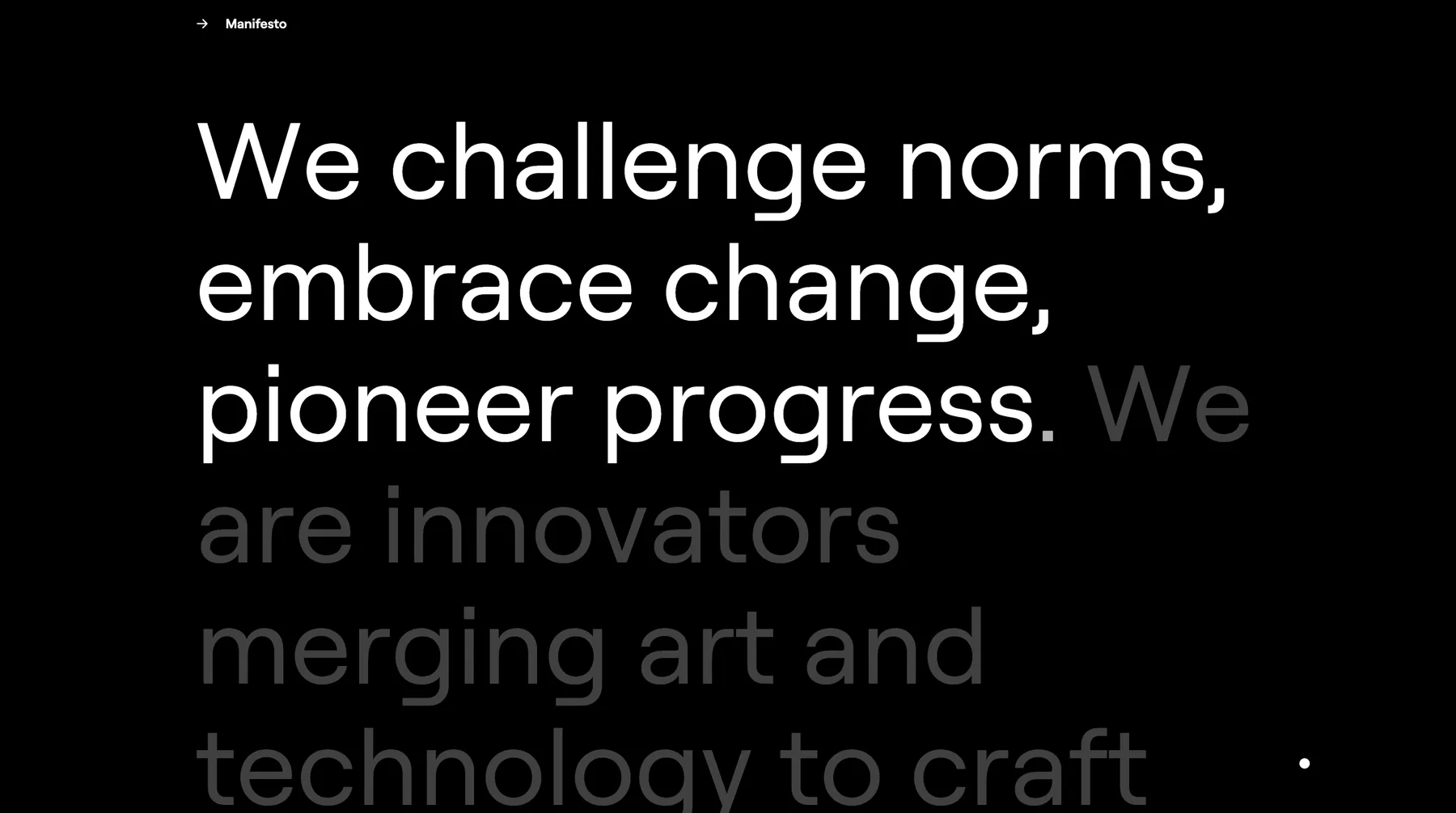
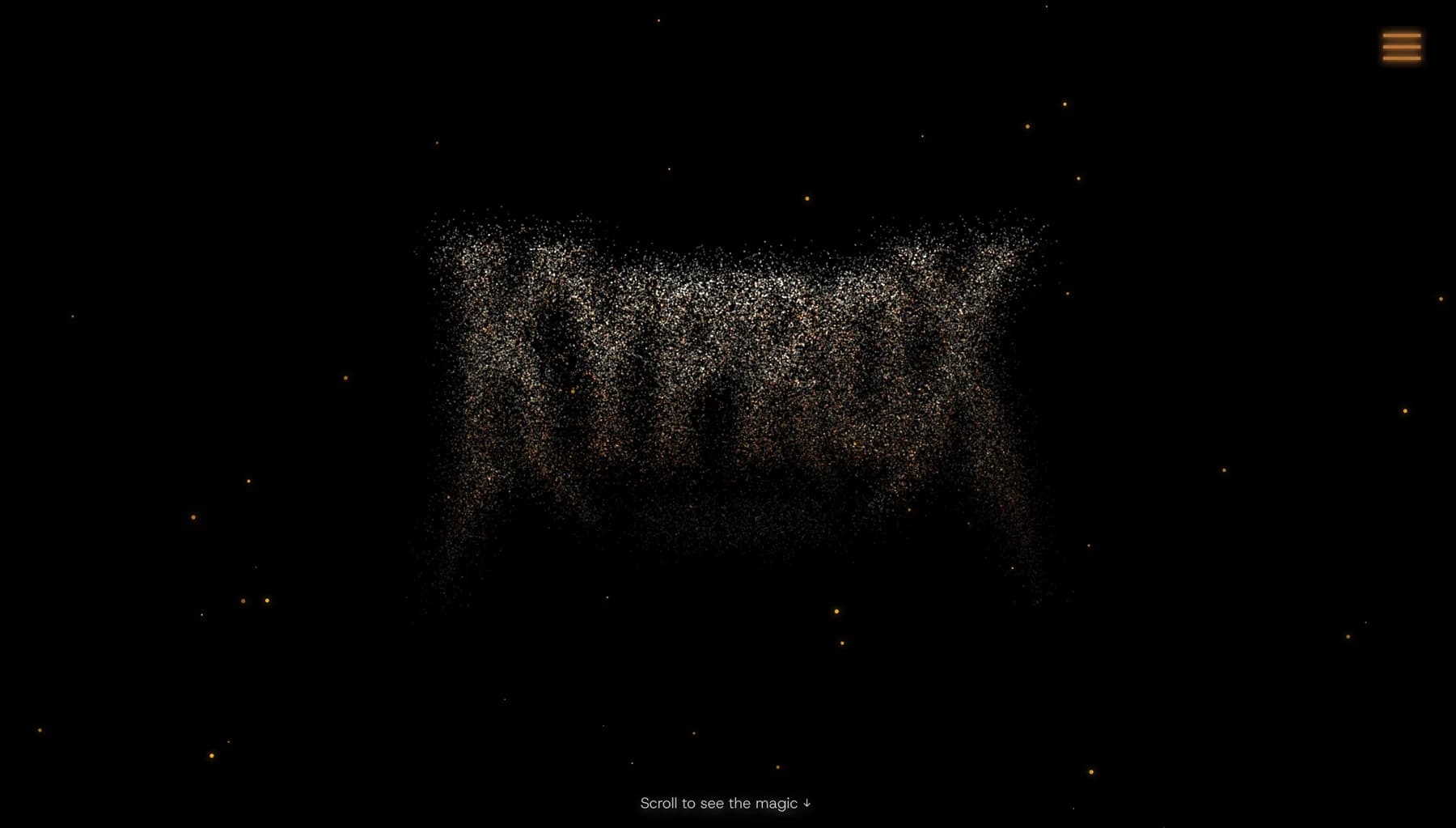
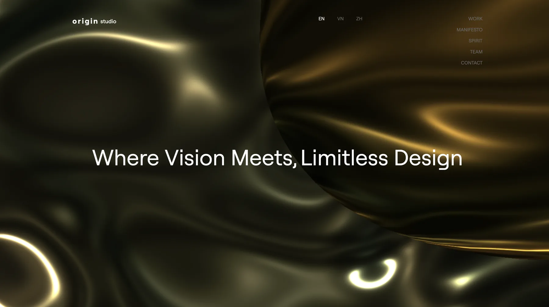
Origin is the website of a design studio. Its purpose is to show — not describe — how the studio thinks: a moving 3D surface on arrival, a manifesto revealed line by line as visitors scroll, and project imagery arranged in a composition rather than a grid.
The challenge
Studios are judged on their own website before anyone sees a portfolio piece. Template layouts looked like every other agency, but ambitious motion and 3D often make sites heavy, jumpy on scroll and difficult to read on phones. The site had to be expressive and still dependable.
The approach
We treated motion as part of the information design. Each animation had a job — introduce the studio, pace the manifesto, move between sections — and anything without a job was removed. Performance was checked on mid-range laptops and phones throughout, not at the end.
The architecture
- React single-page application built with Vite
- Three.js scene for the interactive 3D surface on the landing screen
- GSAP with scroll triggers for text reveals and section transitions
- Split-Type for line-by-line typography animation
- Lenis for consistent smooth scrolling across browsers
- Framer Motion for interface-level transitions
The product
Visitors land on a slow-moving 3D surface with the studio's statement, scroll into a manifesto that reveals itself line by line, then move through selected work and a studio map section before reaching contact.
Key features
- Interactive 3D landing scene
- Scroll-linked manifesto typography
- Editorial project image compositions
- Smooth, consistent scrolling
- Responsive layouts for phone, tablet and desktop
- Language switcher in the header
UX decisions
- Motion always follows scroll position, so visitors control the pace instead of waiting for animations.
- Large type and high contrast keep the manifesto readable over dark, textured backgrounds.
- Heavy effects are simplified on small screens so the story still reads well on a phone.
Technology
- React
- Three.js
- GSAP
- Split-Type
- Lenis
- Framer Motion
- Vite
Deployment
Built as a static single-page application and served from a CDN, with assets optimised for fast first load.
Outcome
The studio has a website that works as a portfolio piece in itself. It stays readable and responsive on the devices clients actually use, and new projects can be added without redesigning the page.